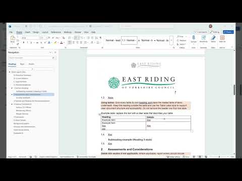
Hi, this video is going to walk you through some of the basics of using the corporate document templates you can download from the Intranet.
These documents have been specifically designed to present information in an accessible format. This means that the design makes it easier for people with a disability such as visual, cognitive or physical disability to read, navigate and understand.
We have a legal requirement to publish information in an accessible format, and we've also got to remember that by designing for people with a disability, we automatically make the document easier to navigate for everyone.
I'm going to use the report template in this video, but the guidance is largely high level and applies to all of the document templates available.
The most important thing to remember is to not change the document styles. This means don't change things like font sizes, fonts, colours, paragraph and line spacing.
Everything has been set up so that it works out of the box. Changing these properties will likely add accessibility issues.
These templates include guidance. All help text has an orange background and is in italics.
Sometimes the guidance text is providing instruction on how to use the template. Sometimes it's providing guidance on what information should be presented. Just remember to delete all guidance text before publication.
Firstly, headings.
The first thing you'll notice is the document has a proper use of headings. As you can see from the navigation panel, this document is structured using headings, which has allowed the navigation panel to show the structure of the document.
Headings break a document down logically. This structure is what enables people with disabilities to quickly navigate through content and is very important.
As you can see in the navigator, clicking on different headings jumps you through the document, and you can see how it's given the document its structure.
Heading structure works like this. Each document has a Heading number One. This sits at the top, and there should only be one Heading One in a document, and it describes what the document is. In this instance, it's the report title.
Beneath the Heading One you can have multiple Heading Twos.
These create sections that you can see here.
If you need a heading within one of these sections, then you move down to a Heading number Three, and then return back to a Heading number Two. As you can see, here's a Heading number Two, and here's a Heading number Three. This is shown in the navigation section, and you can see it is visually different.
This might sound complexed, but the template already has these styles set up, and has examples of how to use them. You simply need to use the examples provided. Most importantly, do not use heading styles because you like how they look aesthetically, and don't format text so that it looks like a heading. It must use the heading style and be used properly, so the document remains accessible.
Next on to report numbering.
Report numbering is linked closely to headings. Sections obviously are a heading within the document.
Section headings, and the associated paragraphs, are now all part of the same list. This will aid with alignment and layout within the document when you're creating the document. It also is an accessibility feature, as the items are now all linked together.
You can automatically change text from the section heading to a paragraph by increasing or decreasing the indent using the toolbar.
So, if I was to create a heading out of this piece of text, I would select it, head up to the toolbar, decrease the indent, and it converts it into a section heading.
To turn it back into a paragraph. I increase the indent, and it automatically picks up the paragraph, indent style.
Bullets and alphabetical lists within a paragraph have their own style. Either copy the styles which are provided, or you can access the style within the styles panel. I'll touch on the styles panel later on in this video.
Next is tables.
All tables need to have a include a label. This is a short sentence that describes the information in your table, ideally using a tag, and a description format.
Giving a table a label allows disabled users, who are maybe using like a screen reader, to understand what data is in the table without having to read all of the data. All tables must have a header row. This is used to describe the information that sits beneath that column.
Again, makes it easy for people to understand what information is held within the table, within each column. These two elements are essential, and must be used on every table within your document.
Next is using images.
Images should only be used when required. Do not use images for decorative purposes. Do not use images that contain text. Whether that's large or small text must be presented as actual text in the document. So people using a high level zoom, or using a screen reader can easily access that information.
When an image must be used, it must include a description of the image, known as 'alt text'. To do this, you first insert an image into your document. I've already got one here. You select the image. If you double-click the image, a picture format toolbar will appear at the top. If you click the 'Alt Text' button, a panel will appear on the right here. In this box, you insert the description of your image. In this example, it's the council logo.
The description needs to contain enough information, enough detail so that somebody who's relying on the 'alt text' understands its meaning as much as somebody who can see.
Next is styles.
Each element of this document such as headings, lists, paragraphs have a predefined style. If you ever need to locate a style, you can do so from the style section in the toolbar.
This can look quite confusing, and it can be hard to locate the correct style, and it's often more useful to open the Styles panel, the Styles window by clicking this little icon here.
If you select the different parts of the document, you can see the different styles that are applied.
Do not change these styles. Making a change to a style will apply the change throughout the whole document, and you will likely make the document inaccessible to people with disabilities.
The easiest way to use styles is to use the examples provided, but the styles panel is an alternative way to apply the correct style and useful in some instances.
Finally, I just want to touch on the accessibility checking tools that are built into Word. Once you're in your document, along the bottom here, you can see a few different buttons.
There's the accessibility checker here, so, if you click this button it will... it's automatically scanning your document as you use it, and will highlight issues as they appear. It will highlight all types of different issues from colour contrast to missing headers. It will also try and guide you on how to fix those issues.
Always have a look in the Accessibility Assistant before sharing, and when you've finished working on your document, to resolve any problems that might have popped up.
That's the end of this basic guidance video.
As I mentioned, although only the report template was used in this video, the guidance applies to all of the document templates.
The key is to not change, adapt, or apply your own styles to the document. You are likely to introduce accessibility and usability issues.